Looking at existing e-Books
What does a traditional IOS e-Book look like?
Most e-books available in 'iBooks' are quite uniform. They try to simulate to look and feel of a usual printed book. Even if the e-Book itself has not been developed with interactive integration (such as embedded videos), the iBooks application provides some basic features - such as the ability to search for specific words/phrases within the PDF or alter the font style, size and colour. With these abilities alone, the e-Book experience on IOS is already more interactive than with regular books. However, if e-Books are developed with more interactivity in mind, then some impressive features are possible.

Looking at interactive e-Books

Who Stole The Moon
This interactive e-Book aimed at children is an example of how story telling can be combined with games and activities to keep modern readers engaged and immersed in an experience. The ability to play out parts of the story whilst they are happening is a powerful tool. As it is aimed at children, there is more imagery than passages of text at a given time, as to not overwhelm the audience.
(Video demo: https://www.youtube.com/watch?v=YX_8b8FvJyE)

Al Gore's 'Our Choice'
This book app was introduced as a sequel to Gore's 2006 'Inconvenient Truth' film. This is an example of informative publication paired with interactivity to help communicate the issue of climate change. The e-Book allows users to open up videos and photos, play on-going commentary, and look at infographics. I personally see this as a way of getting an audience excited about the subject matter, who otherwise may have not been interested. This is a great example of how giving the user a minimum amount of control can go a long way in educating them.

Minimal e-Magazine Template
This is more of graphic design approach, with a contemporary, clean layout. Although this is a design for a e-Magazine, it still conveys another way of pairing text and image. At first glance, this looks like a regular magazine layout. However, in the top right corner there are playback buttons that give the user control over the playable header video. I like the aesthetic of embedding a video where a photo would regularly be, as once playing, it emphasises the idea of an animated publication.
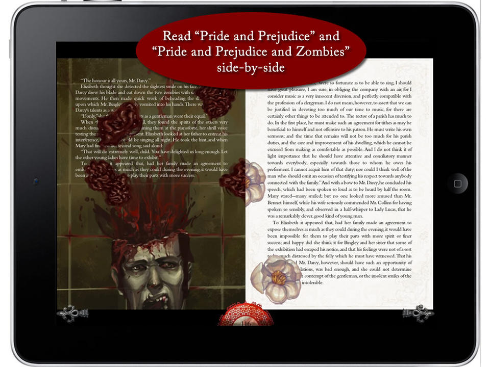
Pride and Prejudice and Zombies
In 2009, Seth Grahame-Smith released a parody novel, combining Jane Austen's 'Pride and Prejudice' with zombies. The content alone is incredibly unique, so when portrayed through an interactive e-Book, there is ofcourse going to be potential for creativity. In the app, users are able to read the original Jane Austen side-by-side with Grahame-Smith's novel. This allows readers to instantly compare the two. This option was taking advantage of the fact that 'Pride and Prejudice' is public domain, just like 'Arabian Nights' - perhaps I could do something similar? I love the contrasting visuals on the double-spreads, as one side possesses animated storytelling full of gore and horror, whilst the other keeps itself clean and classic. I also think that, placing a boring, traditional white book page next to an eye-catching moving one, emphasises the action taking place. Obviously, readers might not wish to read two novels at once, so the animated storytelling that takes place on the left, creatively interacts with the right, so that it is not a waste of space. I think the layered effect seen in the photo, where the zombie's brains fly ontop of the passage of text makes the experience look even more 3 dimensional. Additionally, the creativity from the novel is not lost visually, as the flying brain pieces turn into flowers as they make their way onto the 'classic' side.
(Video demo: https://www.youtube.com/watch?v=MkezjF1SOBE)
(Video demo: https://www.youtube.com/watch?v=MkezjF1SOBE)