Module Title:  Content and Context: Society, Culture and Economy 

Project Title: Arabian Nights (Graphics Rotation 1)

Project Brief


For this project you will be designing and producing an electronic book based on the Arabian Nights.
Although the text is old the way in which you interpret it can and will give relevance to the readers. You should be free to lay the text out in any way that can plausibly serve the user and to either generate or acquire imagery that supports the function of legibility for the reader.
You should specify that your reader is either:
·       Ages: 8-12
·       Ages:12-16 or
·       Ages: 18 and up

The choice of story is yours, but remember that where some Arabian Night stories are charming, others are full of sex, horror and violence and are thus more suitable for certain audiences and may be treated in different ways (e.g. more HBO than BBC).
1.     You will have to design a response
2.     Then collect and collate material
3.     Treat the material in ways that ensue its technical functionality
4.     Learn to manipulate the treated materials to suit the design
5.     Finally to produce a working eBook – suitable for deployment on an iPad or on an Android tablet, with a minimum of 30 screens.

1. Spend the first week of this brief working through a set of integrated research and design functions that will allow you to uncover the cultural framework that will be served by the design: e.g. Is the book to enchant kids, or thrill adults, and what cultural models exist to be applied or challenged to achieve this effect.
2. You will then gather material from sources that are both technically fitted and legally viable.
3. This material will be treated to render it serviceable for industrial application: e.g. you will be shown how to capture images as scans and how to instruct authors about text formatting to avoid production problems.
4. Then, according to your design, you will arrange and artwork this material, according to cultural and aesthetic principals, to achieve the best effect.
5. Lastly, you will be shown how this material is processed to become a viable ebook.
Exploring the targets of different age demographics

I need to think about audience! My choice of age demographic will dictate the path in which I approach the design process and what research I will undertake. Different age groups possess ranged requirements, which can either restrict or widen my design choices:

Ages 8-12

Main focus: Books in the age range are classed as middle-grade books [1]. From research [2] I have gained that middle-grade books are centred around a central character more than the surrounding world. I learnt that the most successful middle-grade books mirror the reader's personal experience at this age. Therefore, I would need to choose a story that focused on one character, and then use a visual style that emphasises this. As this is a younger demographic, I would concentrate on trying to educate in an entertaining way. Looking at popular middle-grade books [3], it seems that many have a fantasy theme to them - most likely as this younger demographic have the biggest imagination of the 3. 

Text/layout
  • readers at this level are normally good readers [2], but the font should still be succinct to aid them
  • 'function over form' - legibility should be main focus, rather than style. Although the typefont should accompany the visuals appropriately.
  • long sections of text should be broken down and separated to stop readers feel overwhelmed or lose interest
  • having interactive elements to the layout could add to the imaginative theme of the e-book
  • younger children have shorter attention spans, and using a variety of interactive features could attempt to keep them engaged - but it also must not distract them
Imagery
  • main character should be main focus - perhaps use a limited colour palette and give character a their own unique colour
  • popular books in this age range use imaginative stories - therefore I would need to have over-emphasised  representations of character forms and settings
  • visual representations of adult themes (violence, sex, etc.) need to be altered appropriately or face censorship
  • images should summarise paired text to aid readers

Ages 12-16

Main focus: any books targeting ages above 12 are classed as young adult novels [1]. This is the most awkward age group of the 3, as maturity varies within this otherwise narrow age spectrum. Young adult novels start to introduce readers to reality of outside world and make transition from central character to the overall world of the story. Therefore, some of the stories can have more somber outcomes to them (such as Hunger Games, a popular young adult novel [4]). 

Text/layout

  • although a young adult approach to an Arabian Night story could suggest restricting my ability to use more imagery in the layout, there is more potential for me to use inventive interactive features on pages, such as more scrollable paragraphs
  • this age range will more likely understand more complicated e-book layouts such as multiple widgets on a page (e.g. video playing, whilst user scrolls a paragraph underneath)
Imagery
  • as this is an older age group, I will be able to use more realistic imagery for the more somber stories, rather than trying to mask them using substituted metaphors
  • illustrations will potentially be less vibrant and exaggerated, as this may come off as too childish for young adults

Ages 18+

Main focus: As this age group is the largest and most diverse, there is no basic outline for what my lesson to the reader should be (as with the previous age groups). This means that I can decide on what message seems appropriate for the story's theme. As this adult age group will be more connected with the realities of the real world and not 'blanketed' by fantasy, I want to try give them social commentary on global issues. However, thats not to say that adults don't read to escape the real world - on the surface I still want to create an encapsulating experience, but one that comes with a powerful dialogue. 

Text/layout
  • although the most mature age group, I cannot assume that all adults are confident readers. Therefore, I would use larger passages of text, but within scrollable text boxes - allowing readers to scroll at their pace. This would also reveal/hide text that may distract the less confident readers.
  • I would want to try use a less traditional layout, and give the readers something exciting that lends itself to the message I am trying to give
Imagery
  • to make a strong message come through I would try to use shock tactics in order to get my audience thinking. The ability to avoid censorship due to the age group would prove a huge benefit to me
  • due to adults being more aware of the world around them, I would try and modernise illustrations of characters and settings, in order to mirror them to the current world. Through this i may possibly point out any similarities between the fictional and modern society.
  • if metaphorical imagery is to be used, I would make it more subtle and hidden than the other age groups as it could seem patronising to adults if I was 'spoon-feeding' them the message


References: 

1. http://www.dummies.com/how-to/content/age-levels-for-childrens-books.html
2. 
http://writeforkids.org/2014/01/the-difference-between-middle-grade-young-adult/
3. https://www.goodreads.com/shelf/show/middle-grade
4. https://www.goodreads.com/shelf/show/young-adult

Statistics Research; who are the largest e-book audience in the UK?


Tablet users in Britain
A Digital Britain report [1] in 2012 revealed that; 
  • owning a tablet device is more common with males than it is with females - with 7% of UK males owning a tablet, and only 5% females
  • the majority of owners are 25-34 years of age, with 18-24 statistically following behind them 
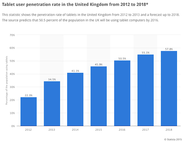
The bar charts (sourced from Statista.com, 2015) below shows the rate at which tablet ownership is growing in the UK. These show that tablet devices are still extremely popular with 25-34 year olds, but now also 35-44 year olds. Additionally, it shows that the gender ratio has altered in favour of females.

References:
1. http://www.economistgroup.com/leanback/the-next-big-thing/who-are-tablet-owners-in-the-u-k-and-the-u-s/1346044220000/

Deciding on a target age range and my goals

After looking back at what opportunities/limitations came with each age demographic and having a think about what I would like to achieve with my e-book, I have concluded that I want to target the 18+ age range.

Message I want to communicate

As I previously pointed out, due to the maturity and social-awareness of readers aged 18+, I will be able to comment on global issues and current affairs. I decided that I want to design an e-book that will attempt to shock readers into thinking about what is going on in the world. 

When I first heard the brief was based around Arabian Nights, I thought it would be interesting to contrast the ancient stories of fiction against the modern Arab world - especially the negative way in which the media portrays it. It would be thought-provoking take these stories of fantasy and magic and portray them through the lens of current western media. 

'Arabian Nights' stories are generally perceived to be aimed at children, due to past adaptations of some stories by mainstream companies, such as Disney and Dreamworks. Due to this it will be interesting to see how this same general public react to these stories being shed in another light, and possibly point out some depressingly-real stereotypes currently shown in news reports.

More specific age range

From looking at the UK's tablet audience analysis, I was glad to see that the younger spectrum of the adult age range had a high percentage of previous tablet access (18-34). This is due to the fact that this was the group of ages I wanted to try and target within my 18+ demographic. 

I want to target the 18-34 age range specifically as they have a large influence on social media. Audiences who are dedicated to social media are an invaluable resource when it comes to raising awareness in a technology-driven age. Hopefully, if my e-book can get them thinking, they will get a debate going online. 

Layout and imagery goals

As a large percentage of my personal target audience already have access or own a tablet device, it would be safe to assume that they are relatively confident with the interactive potential it provides. Therefore, this means I can use some interactive additions to my e-book that other audiences may not have fully understood. I will need to see what features are necessary when I get to the design stage, but at the moment I am thinking about perhaps including accompanying video/voiceover. 

Since I want to take advantage of my audience's interest in social media, I may also want to think about integrating 'share' buttons. This is something I will need to look further into.

Having a look at Arabian Nights Stories

'Arabian Nights' (originally titled One Thousand and One Nights) is a collection of mainly Middle Eastern tales. The main story is of Shahryar, a King who kills his wife after finding she has been unfaithful and decides to marry a new wife everyday and kill her the following morning. Shahryar's Vizier, has two daughters, one of which devises a plan to stop Shahryar's endless killing. Shahrazad, the Vizier's daughter marries Shahryar and tells him a story each and every night, leaving them incomplete. The king finds the stories so entertaining that he does not kill Shahrazad in order to hear the continuation of the story the following day. This goes on for one thousand and one nights, when the king finally abandons his cruel plan [1]. 

After looking over some of the many stories in the 'Arabian Nights' collection, I have decided on four that I feel will be interesting to adapt into a modern narrative context.

The Tale of the Three Apples

Summary (from 1000into1night.wordpress.com) [2]: 
A man wrongly kills his wife, cuts her into pieces and throws her into the river Tigris. He did so because a slave tricked the man in believing she was his mistress. The slave had a rare apple which the man had brought to his wife and the slave uses this as proof. The Wazir (Ja’afar) finds out it was one of his slaves but asks the Caliph’s pardon, because it is not as wondrous as one of his tales.


My analysis of 'the Tale of the Three Apples' (story source; link [2])


The Sleeper and the Waker
Summary (from 1000into1night.wordpress.com) [4]: 
Abu al-Hasan divides his inheritance into two. He lives of the first half and gets a lot of friends. These friends leave him when he has run out of money. He then leaves of the second half, never to make friends again. He only invites people for one night and then never salutes them again. He meets the Caliph in this way, who is disguised. He says to the Caliph he tells the Caliph a story and says he wants to be Caliph for one day to take revenge on the shaykhs and Iman of a mosque because they don’t like him inviting various people into his home. The Caliph puts Abu to sleep by use of a drug. Abu wakes up in the Palace and everybody pretends he is the Caliph. He orders to punishes the shaykhs and the Imam and enjoys the luxuries of the Palace. Abu is put to sleep again and brought to his own home. When he wakes up he finds his mother next to him, who says he has been dreaming. He denies and beats his mother. But folk outside seize him and he is brought to prison. He repents and goes back to his home, taking up his old habit of inviting people. He again meets the Caliph, whom he thinks is the Devil. The Caliph denies and says he made his wish come true. The Caliph is again invited and again Abu is put to sleep and brought to the Palace. When he wakes up he thinks he has become mad, but eventually the Caliph comes out of his hiding place laughing and honours him. Abu is married to Nuzhat al-Fuad.


When Abu and Nuzhat run out of money they play a trick on the Caliph and his Lady. They pretend to be dead, Abu to Zubaydah, and Nuzhat to Caliph. They receive a hundred dinars and a piece of silk both. When Lady Zubaydah and the Caliph quarrel on who’s actually dead they send their servant to the home of Abu. But as Abu sees them coming both he and Nuzhat pretend to be dead in turns. To solve the matter the Caliph and Lady Zubaydah go to the home of Abu to see for themselves. When they see them both dead, the Caliph says he would give a thousand dinars to know who died first. Then Abu springs up and says he died first. The Caliph understand the trick Abu played and is enjoyed by it. He gives the thousand dinars and increases his solde. Abu and Nuzhat both live happily until they die.
My analysis of 'the Sleeper and the Walker' (story source; link [4])


Ali Baba and the Forty Thieves

Summary (from 1000into1night.wordpress.com) [6]:
Kasim and Ali Baba are brothers. One day Ali Baba finds out about a cave which belongs to a band of robbers. When he tells his brother, Kasim, he goes to the cave as well. He is found out and killed by the robbers. Ali Baba finds his brother and takes him home with his asses full of gold. Kasim is buried in secret, a tailor is blindfolded and got to the house where he sews to body. The thieves find Kasim gone with a lot of gold so they are sure there is another person who knows about their secret. One thief finds the house through the tailor. He marks the house with white chalk. Morgiana, a slave-girl of Ali Baba, notices this and chalks every door. A second thief tries with red chalk, but Morgiana finds out and chalks every door with red chalk. The third thief remembers the way. The Captain will come with mules with jars of oil and thieves in others. He is invited in Ali Baba’s house. Morgiana finds out about the plot and kills the robbers by putting boiling oil in their jars. Only the Captain knows to escape. The Captain tries again by opening a shop and to get invited, in disguise, by Ali Baba’s nephew. However, again Morgiana finds out about him and stabs him to death. Morgiana is married to Ali Baba’s nephew and he and his family become rich.

My analysis of 'Ali Baba and the Forty Thieves' (story source; link [6])


References:
1. http://www.britannica.com/topic/The-Thousand-and-One-Nights
2. https://1000into1night.wordpress.com/3-the-tale-of-the-three-apples/
3. http://www.theguardian.com/world/2013/sep/25/revealed-qatars-world-cup-slaves
4. https://1000into1night.wordpress.com/26-the-sleeper-and-the-waker/
5. http://news.sky.com/story/1568417/saudi-deal-dropped-as-briton-faces-lashes
6. https://1000into1night.wordpress.com/ali-baba-and-the-forty-thieves/

Looking at past adaptations of 'The Tale of the Three Apples'


When researching various adaptations of 'Arabian Nights' as a whole, I could find many different approaches. However, when looking specifically at the 'Tale of Three Apples' story, I could not find many previous depictions. It is clearly not as widely-adapted as 'Aladdin', 'Sinbad' and 'Ali Baba and the Forty Thieves'. This is no coincidence, as these 3 stories are undeniably the most well-known (even though they were not part of the original 'Arabian Nights' collection [1]). However, I picked out images that had various styles;


Sarah Piper (2014) [2]

This monotone art style is relevant to the serious tone I want to bring to my e-book telling of the tale. The realistic look of the woman's corpse in the chest sets a dark and depressing tone - something that will help achieve the shock factor I'm looking for. The nooses in the background foreshadow the theme of execution that the story possesses. This is definitely a more adult visual take on the story. The illustration almost resembles an old photograph due to the rough border, and the smudges give a dirty aesthetic, which is emotionally draining. However, I feel that the image tries to include all the factors of the story at once (with the apples in the foreground just placed in a static fashion) giving the objects no purpose.


Nusrat Hajiyev (2013) [3]

The visual style of this artist's approach looks very traditional, as if it could be from a ancient publication. This is aided by the blank facial expressions of the figures, and their statuesque poses. The colours, and the aesthetic of the trees almost look like an oriental painting. The overall mood of the doesn't feel as dark, and depressing as I'm looking for. I get this impression as the woman in the chest seems to be alive, rather than dismembered as described in the story. I can tell from the garments in the image that the artist was trying to recreate a period similar to that in the tale. 


Benny Thomas (2013) [4]

The simplistic art style resembles short comic strips found in newspapers. Although this aesthetic is most likely about content over style, it looks too boring for me. Although it is a black and white piece, the lack of shades is visually tiring. With Sarah Piper's monotone piece, there were still various shades of black, which added more depth. However, the aspect I like about this piece, is the comic page layout. It made me think about possibly using this layout in my e-book. Comic books can be extremely powerful when it comes to telling a narrative effectively. In addition to this, with the potential of e-book technology, I could attempt to make a e-book comic where each panel is animated. This could be very simple and short, using a GIF file.


Bright Readers Childrens Book (n.d.) [5]

Although I am not targeting children with my e-book, I thought it would be worth analysing the visual style of this children's book, for variation and comparison. Due to the young demographic, the characters in this approach look friendly and content. As when compared to Sarah Piper's illustration, there is obviously not going to be any de-limbed woman on this cover. However, just because this version isn't aimed at older audiences, doesn't mean that I can't use this same style, but then alter it. For example, if I want to make my e-book shocking, then surely using an art style aimed at children to portray adult themes, such as graphic execution, would achieve this? 


References:
1. http://interestingliterature.com/2013/01/30/surprising-facts-about-aladdin/
2. http://thearabiannightsprints.blogspot.co.uk/2010/10/tale-of-three-apples.html
3. http://book-graphics.blogspot.co.uk/2013/05/three-apples-fell-from-sky.html
4. https://bennythomas.wordpress.com/2013/04/12/the-tale-of-the-three-apples-13-1-7/
4. http://www.firstcry.com/shree-book-centre/shree-book-centre-tales-from-the-arabian-nights-the-three-apples-and-sindbad-the-sailor/321774/product-detail

Linking 'Arabian Nights' to the Modern World

The 'Arabian Nights' Collection has been adapted in many different ways throughout the years. This has been been through many different mediums, such as theatre, film and publishing. As I want to try take a modern-day approach to 'the Tale of the Three Apples', I feel it would be very informative and interesting to have a look at how this has been attempted in the past.

Syrian Refugees

1001 Nights, Douglas Rintoul (2014) [1]


In this 2014 stage adaptation of the Arabian Nights collection, a young Syrian girl, Shahrazad, leaves her mother in war-torn Damascus to seek refuge in the UK. In this approach, Shahrazad is telling the stories to her new UK neighbours in a council estate, rather than to the King. The director wanted to distance the production's influence from the well-known Disney 'Aladdin' adaptation (1992). I thought this was highly relevant, as this is also what I want to achieve with my approach - I want to change the way reader's think about the whole 'Arabian Nights' concept. This version is also extremely significant at the moment, due to the Syrian crisis being covered in all news outlets, and the resulting influx of refugees into European countries.


(1001 Nights trailer: https://www.youtube.com/watch?v=cg12iMmYdgk)


Palestine/Israel Conflict

Amjad Nasser (2015) [2]

In this Al-Araby blog, Nasser suggests that 'Arabian Nights' narrative has an underlining message of resistance. This interesting theory suggests that Shahrazad's actions are a reflection of how the Palestinians' cause ''must have a narrative, otherwise it is futile''. I found this blog eye-opening, giving me another Middle-Eastern issue I could tackle. Amjad Nasser believes that there are only two weapons the King in the story possesses - the sword and speech. The latter obviously being the stronger and more devastating. Shahrazad must rely upon the only weapon she has, speech, in order to prevent the King from using his sword to massacre more women. This is a powerful metaphor for the Palestinians' struggle against the Israeli army, and is also a suggestion for them to use narrative. The idea literally plays upon the idea of 'the pen is more effective than the sword'.


References:
1. http://www.maidenhead-advertiser.co.uk/Entertainment/Theatre/Latest-Theatre-News/Arabian-Nights-with-a-modern-twist-26062014.htm
2. http://www.alaraby.co.uk/english/blog/2015/4/21/arabian-nights-a-lesson-for-modern-palestinians

Looking at existing e-Books


What does a traditional IOS e-Book look like?

Most e-books available in 'iBooks' are quite uniform. They try to simulate to look and feel of a usual printed book. Even if the e-Book itself has not been developed with interactive integration (such as embedded videos), the iBooks application provides some basic features - such as the ability to search for specific words/phrases within the PDF or alter the font style, size and colour. With these abilities alone, the e-Book experience on IOS is already more interactive than with regular books. However, if e-Books are developed with more interactivity in mind, then some impressive features are possible.


Looking at interactive e-Books

Who Stole The Moon

This interactive e-Book aimed at children is an example of how story telling can be combined with games and activities to keep modern readers engaged and immersed in an experience. The ability to play out parts of the story whilst they are happening is a powerful tool. As it is aimed at children, there is more imagery than passages of text at a given time, as to not overwhelm the audience. 


Al Gore's 'Our Choice'

This book app was introduced as a sequel to Gore's 2006 'Inconvenient Truth' film. This is an example of informative publication paired with interactivity to help communicate the issue of climate change. The e-Book allows users to open up videos and photos, play on-going commentary, and look at infographics. I personally see this as a way of getting an audience excited about the subject matter, who otherwise may have not been interested. This is a great example of how giving the user a minimum amount of control can go a long way in educating them.

Minimal e-Magazine Template

This is more of graphic design approach, with a contemporary, clean layout. Although this is a design for a e-Magazine, it still conveys another way of pairing text and image. At first glance, this looks like a regular magazine layout. However, in the top right corner there are playback buttons that give the user control over the playable header video. I like the aesthetic of embedding a video where a photo would regularly be, as once playing, it emphasises the idea of an animated publication.


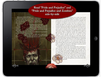
Pride and Prejudice and Zombies

In 2009, Seth Grahame-Smith released a parody novel, combining Jane Austen's 'Pride and Prejudice' with zombies. The content alone is incredibly unique, so when portrayed through an interactive e-Book, there is ofcourse going to be potential for creativity. In the app, users are able to read the original Jane Austen side-by-side with Grahame-Smith's novel. This allows readers to instantly compare the two. This option was taking advantage of the fact that 'Pride and Prejudice' is public domain, just like 'Arabian Nights' - perhaps I could do something similar? I love the contrasting visuals on the double-spreads, as one side possesses animated storytelling full of gore and horror, whilst the other keeps itself clean and classic. I also think that, placing a boring, traditional white book page next to an eye-catching moving one, emphasises the action taking place. Obviously, readers might not wish to read two novels at once, so the animated storytelling that takes place on the left, creatively interacts with the right, so that it is not a waste of space. I think the layered effect seen in the photo, where the zombie's brains fly ontop of the passage of text makes the experience look even more 3 dimensional. Additionally, the creativity from the novel is not lost visually, as the flying brain pieces turn into flowers as they make their way onto the 'classic' side.

(Video demo: https://www.youtube.com/watch?v=MkezjF1SOBE)

Thinking about my layout


Although I'm creating an e-Book in this project, I still need to have a creative layout that sets it apart from others. With my choice of layout, I can either warp the shape of paragraphs to give the book a more illustrative layout, or even use a traditional layout of another genre to mimic/parody. I have tried to look at a relevant range of layouts that I found interesting.

Examples of shaping text placement

This is a good example of how text can by placed within an image as a substitute. By directly connecting my story's text with the accompanying illustrations, my e-Book will highlight the importance of the images. I could shape paragraphs of text as key objects within an illustration. For example, as the sunken chest is a key object in 'the Tale of the Three Apples', I could manipulate a passage of text into the shape of the chest. This would highlight that it is an important object at this point in the story. This could also be done with the boulder that blocks the entrance to the cave in 'Ali Baba and the Forty Thieves'. A disadvantage to this design form however, is the fact that some shapes may make the paragraph of text difficult to follow, compromising the functional aspect of the e-Book.


With this example, the passage of text is manipulated in a way that flows towards the imagery smoothly. the text substitutes the spray of the perfume, but also brings peoples attention to the illustration at the end of the text. I like the pattern that cradles the text as it breaks up the white space.


When I first looked at this layout, I thought that the shape of the fish was cut out from the mirroring blank page. This would then allow the text on the page behind the fill out the silhouette making the shape seem it was made out of words. This is an interesting idea, yet it might suit a printed publication more than an e-Book.


This design is similar to the first two, as the text is used to substitute an image (in this case, the steam from the kettle). However, this example is more creative. The curved flow of text is eye-catching and naturally fits the accompanying illustration. This is something I definitely want to experiment with in my design phase.
Here, the manipulated extracts of text aren't warped into an image, but rather just regular shapes. Paragraphs are rotated or slanted to make them stand out from block of text (right page). Although visually attractive, I feel that it would break up the natural flow of reading and some readers may find it confusing from a functional stand point. I do like the large stranded key words 
though.


This lithographic poster is an illustration from 'Alice in Wonderland' that consists of text from the entire story. The image has been created by changing the font colour of certain words. This is an interesting method as it still keeps the text legible, whilst also creating an image. I want to try this, yet I wont use white font, as legibility is important to my aims.


Examples of clean, uniform text layout

These are examples of more simple, modern layouts. The clean style of these are beautiful from a design standpoint. 

With this first example, the majority of the text seems traditional. It's the paragraph on the right that catches your eye as it is slightly slanted. This shows that any subtle alteration can manipulate a reader in to glancing at it. I also like the placement of the overlapping header. This overlapping theme is continued with the diamonds on the right page. Another aspect I admire is monotone look, with only one additional colour. It means that anything that possess this pinkish hue stands out straight away.


This is an example of a page from the minimalist magazine layout I looked at in my 'interactive e-Book' research. This very subtle approach is simple, yet professional. The fact that only text exists on the page means that there are no distractions. However, as I want to have interactivity, and visuals in my e-Book, I would add some in. I would have the page look like this at first, keeping the uncluttered look, but then have visual flow in at as the user swipes along. Almost like a animated transition from page to page, at key moments.


Looking at an Arabic newspaper layout

Since my aim is to tell the story from a modern media perspective, portraying the events through several mock newspaper articles would be effective. For each page, I could have a headline, highlighting the typical way western media portrays issues in the Arab world. For example, for 'the Tale of the Three Apples', on the page where the Caliph finds the dismembered body in the chest, I could have a headline such as ''Muslim man found with dismembered body of woman''. This would emphasise the fact that western news outlets always seem to find a way to bring Islam into Arab issues. Not to mention, many villanize Muslim men as abusive towards women. I think this would be a hard-hitting method of portraying the story, and emphasising issues in media.